This topic was automatically closed 10 days after the last reply. New replies are no longer allowed.
@ all:
What do you think about adding an option that allows you to customize the icon color?
This way you could use your favorite colors to reflect the different listing state.
What do you think about that idea?
Please see this mockup with customized icons:
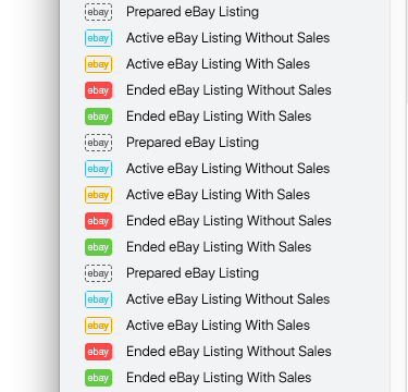
Regards, Kristian
3 Likes
YES!! Would love to be able to set the colors to our individual liking.
Perfect… yes please…regards, Sandy
Also, PLEASE add an option to also hi-light/color the ENTIRE title, like GS6 did. The small icon is just too small to be quickly noticeable. Having the entire title hilighted is just so much easier to see and an option to have the icon color reflect the current listing state, either Auction or Buy-It-Now. I use the “Auction” state listing template titles for Headers and Notes. See attached screenshot. Thanx!
1 Like
That is why I always stayed with GS6 for as long as possible… so, yes please to any or all suggestions…
1 Like
I agree. GS6 colours were far more prominent. Wouldn’t mid the option to define my own colours as well.
1 Like
Option is most welcome. Each person has individual tastes.
Steve
2 Likes
The pale blue and the pale green icons are too close for my eyes to easily see at a glance, the colors are too close because they are only an outline and not solid filled in. The small and only black and white items in the menu bar and also difficult to see at a quick glance.
If they were able to be moved to my preferred order like they were in GS 6 would be helpful as well. The “customize toolbar” is in the menu but I can’t access it.
2 Likes
just saying. since the most common color blindness problem is red-green… that actualy using a green & blue combination may be a problem for some users.
because of this it is almost standard around the world that “Green” Traffic lights are more Cyanish in color.
(have a family history of color blindness, that only slightly affects me in a very strange way.)
1 Like
“rlmartin5d1 kristian
The pale blue and the pale green icons are too close”
being a critic again…
I would have though that a going auctions “ebay” icon infront of the listing should be Green and a stopped/sold item Red (as in Traffic lights) as Blue (and especialy light blue) seem to be Neutral (as in Electrical Neutral wires, well here in Australia. what are they in other countries).
so realy wanting that chance to chang ethe Icons colors. regards, Sandy
I think this is a good compromise. I don’t have trouble with colors. Some have replied they don’t want the colors for a more clean look. Not sure anyone mentioned already, but I use to work with 3 people that were color-blind, so they would see the colors as shades. Not sure the colors would help them out. But offering an OPTION where you could have color if you wanted is an excellent offering.
Or maybe a toggle so that the user who wants it to stand out can, but those who think it’s too obtrusive can pass?
I also have sight problems and would probably toggle it on because of the ease of picking out auctions vs fixed price.
Would that require a lot of work on the coder’s side?
YES!!! Bolder colors please! It is far to difficult to see the small little icon.
1 Like
I just switched over to GS7. Yes, please switch over to highlighted title as in GS6. It is very hard to read the small icon.
1 Like
Just to clarify: The plan is to make the icon color editable, not to bring back the highlighted titles:
Different Color Icons were GREAT to easily and quickly visualize between Auction vs BuyItNow listings.
Color Highlighting of the Entire Title to denote “listing state” was much more easy to distinguish at a glance as many people have mentioned.
1 Like
We already use colors to visualize the listing state and we don’t want to change this (again).
Regards, Kristian
1 Like
Thanks for the clarification. I look forward to that change. I still wish the title was colored as well. It could even be a transparent color highlighting the title, and would fit in with the GS7 interface. Color highlighting really helps usability, and work flow. It seems others share that view as well. Thanks!
3 Likes