Hi, just listed my first auction to ebay since all my problems.
still watching (and revising some auctions in that are running in GS6)
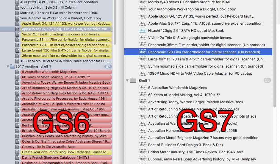
the listed auction in GS7 just does not stand out enough, compared to GS6… (well when you add glasses, and cataracts, old Age etc…)
can I ask for a feature request to add a highlight (selectable color.?) around the entire auction listing, like in GS6, and about that colour, light blue (which for me does not stand out with cataracts, can I get an option to change it to a bright color… (preferred the bright colours)
this is a personal preference thing I know, but does anyone else feel the light blue is just too easy to miss…
regards, Sandy (my doctor offers me a free government cataract operation, but I worked for a wonderful man that went blind for a year after his op, so never ever)
Mmmh well, I have to say that probably I voted for too obtrusive, but actually @nurgles is not wrong, icons might be too small and not very eye catching. Especially when browsing a large group of listings, the entire title colored might help when you are going to catch expired listings… or looking for an active one inside a large group of not active listings.
I would also like to see a mother color “highlighting” for an auction that is being listed for the second time… (ebay Australia atleast used to offer a no listing fee policy for items that sold when listed for a second time… am not sure if this is still the case, but if it is I would like to see a new colour)
regards, Sandy
the GS 6 highlighting and lovely differentiation between non running running sold etc auctions was the main reason I stuck with GS6 over GS7… (the HTTPS argument I dis not understand)…
so would kill to have that back again… just saying it is a personal preference…
I know the newer OSX’s are going for more muted effect… but this allowed me to work quickly and see what what what EASILY… not having to stare…
by the way… what is with that “EBAY” icon at the front of a listing anyway… are you planning to make the program list to other auction sites other than ebay… cause if not then it is a bit of overkill.
eBay now requires https links for photo and any other link, and GS 6 is not updated to insert httpS, so you had to switch to GS 7 anyway.
Uhm I did not think about it… well it would be something infinitely more useful than color (selling on more platform within GS, I mean), don’t you think? Sure color as you explained would be a useful change and I agree with you, but there are more important thing I guess, like the synching I have been praying for for months… or integration with other platforms …
yes, forced to switch over something I did not understand. HTTPS…
but dearly miss the “LOOK” and feel of GS6. there are minor operational points I would like to see changed, but that is only because of the way I work… (no doubt every one has their own preferences and styles etc…)
have not a clue about “syncing”.??? and what other platforms are needed…
hate other web auction listing sites, (Gumtree in Australia, etc)… and many of my friends have been ripped off on them… where as I have been ‘caught’ on ebay by fraudulent dealers (I have been bought 7 items this year that they had to refund on duds frauds and no shows), but ebay protections have been good for the most part… (they did refuse to do anything about one customer who demanded a refund or she would leave bad feedback, “Feed Back Blackmail”, but one @#$%^ in almost 10 years is such a low percentage it is almost incalculable… yes I have to pay for it though fees, but the protection is worth it… (I use the Australia Post Ebay Satchels all the time, and have not had a single problem in over a few thousand them)…
and find this interactive forum also great to see what others do and think… (apart from they Adobe forum, and a few others, support from other computer programers for their wares is almost non existent).
the only real problem I have is getting apathetic obeyers to leave feedback… I still only get 1 out of then sales leave feedback. why…? if they did my rating would be in the 10 thousands…
I believe the bold background colors are to obtrusive. Besides, you want to stay true to the more clean look of the modern Mac OS. Perhaps a compromise. Have the text colored to match the pastel boxes. Still will have a nice, clean look, but a little easier to see.
put finger print smudges on your glass and then mute the colour another 50% with a tan filter… that is what cataracts look like. hence my request for bright colours… (don’t forget non of us are getting any younger. how many GS users out there are in the 65+ age group.?)
how about user selectable colours…? on the whole I did prefer the GS6 interface… and miss it.
It’s like the “way” images are sent to ebay, now they are (http)Secure .
Not yet… !!
So many people think that not receiving a feedback is a loss. I don’t understand why! Better a bunch of feedback less than 1/4 of bunch more with low valuations or worse neutral/red. I am always anxious when I see my feedback number is grown and still don’t know how…
I think it might be not a good choice, a red or green title would be soooo much more difficult to read instead of a different icon. Maybe they might use more intense colors…
since the standard colour blindness if more often red-green, I was more meaning brighter colours… (hence Traffic lights green is more often Cyan than actual Green, and the red more Orange. trivia pursuit)
but I hope that you get what I meant… as I said it was only a personal preference.
I second (or sixteenth) the motion to add back the color bars as before. Not having them is a minor annoyance for me but my wife really complains about the new format. To help her out, I tried to find a KEY to the color coding regarding the existing scheme (i.e, dimmed out black, blue, solid green as opposed to dimmed out green, etc) but couldn’t find one in the manual. Perhaps there was one mentioned in an instructional video that I seem to recall. At any rate, I’m always in favor of overkill when it comes to making things obvious, even if it is less elegant than what we have now. Thanks for providing a chance for this type of conversation with the developers.
For the current system to be effective, the button would need to be a solid color. expired actions with the dark gray and sold auctions with the full green all are sufficiently visible to me anyway.
I also preferred the release 6 view but understand the HUI science is ahead of me.
Customer usability and convenience is much more important than copying Apple’s color scheme. I’m not demanding a total return to the GS6 color scheme, although it would be nice, but the current GS7 color scheme is very user unfriendly and we need a better one.